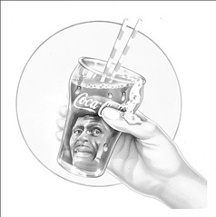
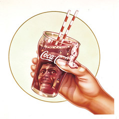
I then adjusted the overall levels of the cyan channel, bringing the shadow slider up to where the darkest shadow detail remained in the image. This usually gives you an indication of whether an image still retains enough information to work with.
So now it's possible to see a wider range of hues. There's a little green in the glass, and the outer outline ring of the circle is a similar color. The skin tones in the hand are also looking much better. Dave usually uses very bright colors, so I can tell that the original didn't look this somber originally. My hunch is that the outer ring should be blue-green along with parts of the glass, and perhaps the fill color within the circle should be a bit less green.
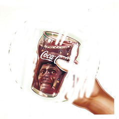
It's become apparent that I'll need to adjust portions of the illustration separately, then merge them together into a single image. The 3rd image has had the cyan increased, and shows the parts that didn't need more blue being erased. This is repeated for every element that needs individualized tweaking - maybe 5-6 components.


4 comments:
Very interesting information. The amount of work that went into cleaning up these images is most impressive.
Great explanation of your process- did you need to do this for everything...?
No Chris
About 4 others had bad fading like this. Most required color balancing, a little brightening and spotting. And some very difficult ones that were scanned from printed samples, so a lot of halftone dot eradication, which is also a big pain.
Valuable post!!
Post a Comment