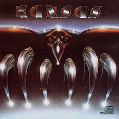
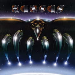
Kind of shocking while working on the book, to see what the original paintings look like, compared to the image that ended up being printed in not the most accurate fashion.
Peter Lloyd's illustration for this Kansas album cover is a good example. Never seen the little edge of the earth until now either.
Peter Lloyd's illustration for this Kansas album cover is a good example. Never seen the little edge of the earth until now either.


1 comment:
Hi grreat reading your post
Post a Comment